|
|
Post by countofmontecristo on May 23, 2015 17:51:22 GMT
I don't mind the new badge but I think it looks daft on the home strip - red and white stripes on red and white stripes. I've often thought that it would be better to have one of the old badges on the home strip and the new one on all other merchandise.
|
|
|
|
Post by terrorofturfmoor on May 23, 2015 17:53:05 GMT
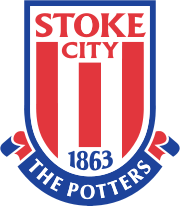 So what does it actually mean? We have three stripes on the badge, do they represent the tower blocks of Hanley? The fighting spirit of the three musketeers? Or nothing at all? Obviously Stoke City FC is our club's name and 1863 is the year we won the cup, but what about the rest. Does anybody know? I think it means that we're nicknamed "the Potters"!!!  |
|
|
|
Post by kidcrewbob on May 23, 2015 17:53:37 GMT
I'm a traditionalist and much prefer the City crest with its very appropriate motto - the new one is ok but as others have said bland and lacking in meaning or symbolism - not losing sleep over it though!!
|
|
|
|
Post by pottersrule on May 23, 2015 17:55:15 GMT
Wouldn't mind an modernised version of this tbh with Stoke City rather than SCFC. You can interpret the building on the bottom right as a kiln or a mosque so everyone is happy.That's a winner. |
|
|
|
Post by Deleted on May 23, 2015 18:23:05 GMT
So what does it actually mean? We have three stripes on the badge, do they represent the tower blocks of Hanley? The fighting spirit of the three musketeers? Or nothing at all? Obviously Stoke City FC is our club's name and 1863 is the year we won the cup, but what about the rest. Does anybody know? I must have missed the cup win! |
|
|
|
Post by Pugsley on May 23, 2015 18:35:53 GMT
It's an abomination, end of.
|
|
|
|
Post by bayernoatcake on May 23, 2015 18:42:49 GMT
It's an abomination, end of. Nah |
|
|
|
Post by Olgrligm on May 23, 2015 18:52:41 GMT
The answer to the original question is that it means fuck all.
|
|
|
|
Post by foster on May 23, 2015 19:12:29 GMT
So what does it actually mean? We have three stripes on the badge, do they represent the tower blocks of Hanley? The fighting spirit of the three musketeers? Or nothing at all? Obviously Stoke City FC is our club's name and 1863 is the year we won the cup, but what about the rest. Does anybody know? I think it means that we're nicknamed "the Potters"!!! Speaking of which, isn't it about time we came up with a cooler nickname? A mean, come on, the potters just sounds dogshit. |
|
|
|
Post by redandwhitetundra on May 23, 2015 19:44:18 GMT
Red, white and blue = Stoke colours (traditionally red-and-white shirts), and good ol' fashioned colours of Great Britain and Iceland (our owners at the time the badge was redesigned).
I'm not sure if this is a genuine thread, or a really bad attempt at fishing...
|
|
sting
Youth Player

Posts: 354
|
Post by sting on May 23, 2015 20:02:23 GMT
The fact it is blue has nothing to do with Iceland! The badge was commissioned by Phil Rawlins and designed by an agency in the States. The badge represents the 3 things that SCFC is famous for. The red and white stripes, our founding date and our heritage. It was designed to be simple and easy to replicate on different medium. We own it, unlike the City crest. It is our principal branding statement and if was commercially important to change it. The blue provides a frame, a contrast. If a child can copy it easily then it has done the job. It is instantly recognisable and understood globally.
|
|
|
|
Post by skip on May 23, 2015 21:05:14 GMT
^ all true, but it doesn't make it well drawn. It's proportions are all to piss for a start.
You can tell it wasn't drawn in UK/Holland/Switzerland (where Modernist* design comes from).
*read: proper.
|
|
|
|
Post by wuzza on May 23, 2015 21:14:48 GMT
So what we are being told is that anything that contains more than straight lines and words (that can in theory be drawn by a 5 year old) is a bad design??? Well that's another step forward - must be a few designers / marketing men on the Rock & roll these days if that's all it takes!
|
|
|
|
Post by enuntio on May 23, 2015 22:35:39 GMT
Our current badge is the best badge we've ever had.
It is direct and to the point, modern but simplistic.
Long Live The Badge
|
|
|
|
Post by kemilss on May 23, 2015 22:53:41 GMT
Pretty sure the red on white stripes is just a negative image thing, just like the fedex smbol. It's actually a giant white 'O' -- for oatcake. People were thinking ahead in the 1800's.
|
|
|
|
Post by maninasuitcase on May 23, 2015 23:07:44 GMT
Wouldn't mind an modernised version of this tbh with Stoke City rather than SCFC. The best badge by far. The knot and the kiln are our heritage. |
|
|
|
Post by Pugsley on May 23, 2015 23:18:14 GMT
Here's how you incorporate stripes into a badge.  What pisses me off is that fans weren't consulted. It was foisted upon us by a bloke who's spent too much time in America. |
|
|
|
Post by numpty40 on May 23, 2015 23:19:52 GMT
The old badge represents Stoke as tired and nostalgic.
The new one represents a new start and optimism.
|
|
|
|
Post by Pugsley on May 23, 2015 23:22:30 GMT
The old badge represents Stoke as tired and nostalgic. The new one represents a new start and optimism. Lol, bollocks. It represents a 5 year old with a set of felt tip pens. Drop the pathetic blue potters bit and it's nearly there. |
|
|
|
Post by Gods on May 23, 2015 23:33:04 GMT
The fact it is blue has nothing to do with Iceland! The badge was commissioned by Phil Rawlins and designed by an agency in the States. The badge represents the 3 things that SCFC is famous for. The red and white stripes, our founding date and our heritage. It was designed to be simple and easy to replicate on different medium. We own it, unlike the City crest. It is our principal branding statement and if was commercially important to change it. The blue provides a frame, a contrast. If a child can copy it easily then it has done the job. It is instantly recognisable and understood globally. Do you know who the agency was, I have always been curious? |
|
|
|
Post by numpty40 on May 23, 2015 23:33:23 GMT
It's straight to the point, 'Stoke City', 'The Potters', '1863' and red and white stripes all transferable onto a small badge that has become instantly recognisable as Stoke.
I love it.
|
|
|
|
Post by Gods on May 23, 2015 23:35:21 GMT
Here's how you incorporate stripes into a badge. What pisses me off is that fans weren't consulted. It was foisted upon us by a bloke who's spent too much time in America. It's a funny thing you know, the Juve badge is not a million miles away from our own and yet somehow it screams out 'dynamic' at you, whereas our badge could not look more static and 2 dimensional if it tried. |
|
|
|
Post by bayernoatcake on May 23, 2015 23:39:08 GMT
It screams what the fuck is that animal at the bottom meant to be to me. What is it?  |
|
|
|
Post by numpty40 on May 23, 2015 23:42:19 GMT
Here's how you incorporate stripes into a badge. What pisses me off is that fans weren't consulted. It was foisted upon us by a bloke who's spent too much time in America. It's a funny thing you know, the Juve badge is not a million miles away from our own and yet somehow it screams out 'dynamic' at you, whereas our badge could not look more static and 2 dimensional if it tried. It doesn't scream 'dynamic' to me any more than our badge does. Like I've said before our new badge has managed to capture our name, nickname, date of birth and playing colours in a simple yet effective design. |
|
|
|
Post by prudhoe on May 23, 2015 23:49:34 GMT
The problem with the city crest, and why the club changed it, is the club don't own the copyright to it. When we had that badge there was very little the club could do to stop people selling fake merchandise with the badge on it. Now we have a badge that the club own the copyright to, they can prosecute anyone who uses it without permission.
|
|
|
|
Post by skip on May 23, 2015 23:57:09 GMT
The fact it is blue has nothing to do with Iceland!... It certainly wasn't Eddie Opara at Pentagram, New York, or someone of that calibre and deserved global reputation I know that much. I've got one of my students on a twelve month placement there at the moment and their standards are sky high. Just saying. |
|
|
|
Post by Gods on May 23, 2015 23:57:22 GMT
It screams what the fuck is that animal at the bottom meant to be to me. What is it? It's a bull. Juve is from Torino and the name of the city comes from the word 'toro' which means bull. |
|
|
|
Post by numpty40 on May 24, 2015 0:02:15 GMT
Do you know who the agency was, I have always been curious? It certainly wasn't Eddie Opara at Pentagram, New York, or someone of that calibre and deserved global reputation I know that much. I've got one of my students on a twelve month placement there at the moment and their standards are sky high. Just saying. Never heard of Eddie Opara, is he a good drawerer? |
|
|
|
Post by skip on May 24, 2015 0:03:21 GMT
Pretty sure the red on white stripes is just a negative image thing, just like the fedex smbol. It's actually a giant white 'O' -- for oatcake. People were thinking ahead in the 1800's. I think I can say with some certainty that Lindon Leader at Landor Associates drew the Fed-Ex logo a few more times than the Stoke badge was drawn. One is a conceptual classic - simple, scalable, memorable - whilst capturing the essence of the brand and the other is a er, functional logo. Still, plenty of other football club badges are equally as pedestrian. |
|
|
|
Post by skip on May 24, 2015 0:04:06 GMT
It certainly wasn't Eddie Opara at Pentagram, New York, or someone of that calibre and deserved global reputation I know that much. I've got one of my students on a twelve month placement there at the moment and their standards are sky high. Just saying. Never heard of Eddie Opara, is he a good drawerer? Just a bit yeah.  |
|