|
|
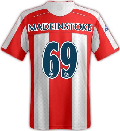
Post by zambianstokie on May 18, 2010 15:24:15 GMT
|
|
|
|
Post by madeinstoke on May 18, 2010 15:26:33 GMT
nice top that.
|
|
|
|
Post by Somebody_Told_Me on May 18, 2010 15:28:12 GMT
I'm not really liking it? well made and I like the design but just not on a football top,
|
|
|
|
Post by RINGO STARR on May 18, 2010 15:28:43 GMT
As alover of their colours blue and black stripes (wish we had an away shirt in those colours) I find this top grotesque.
Looks like one of those dodgy shirts a darts player would wear
|
|
|
|
Post by PotteringThrough on May 18, 2010 15:31:06 GMT
I like it. Saw it on SSN the other day when they were collecting their trophy and initially thought it was designed specifically for them to collect the trophy. I think it looks good.
|
|
|
|
Post by BraveSirRobin on May 18, 2010 15:31:38 GMT
Shocking
|
|
|
|
Post by Deleted on May 18, 2010 15:38:12 GMT
Dreadful.
It looks like a tattoo that someone like Craig Bellamy would get.
|
|
|
|
Post by Roy Cropper on May 18, 2010 15:43:48 GMT
I like it.
|
|
|
|
Post by Bick on May 18, 2010 15:44:11 GMT
absolutely awful.
|
|
|
|
Post by andylgr on May 18, 2010 16:07:18 GMT
It looks like it belongs in a 70's kung fu movie
|
|
|
|
Post by kevan45 on May 18, 2010 16:16:18 GMT
Love it!
Bit of imagination gets none fans buying shirts.
That Adidas nonsense has me on the fence!!
|
|
|
|
Post by 5ManBack4 on May 18, 2010 16:21:03 GMT
They wore that for there last game on sunday it really did look awful.
|
|
|
|
Post by Targaryen Stokie on May 18, 2010 16:21:25 GMT
That's really nice IMO.
|
|
|
|
Post by Birchesheadpotter on May 18, 2010 16:23:08 GMT
Absolute wank.
Kind of suits them.
|
|
|
|
Post by smapples on May 18, 2010 16:32:16 GMT
Looks very american
The Internatzional Dragon Ninjas 1 - Sempadora 0
|
|
|
|
Post by cokecystfit on May 18, 2010 16:38:27 GMT
It looks like a pidgeon eating sick.
|
|
|
|
Post by BioniCPidgeoN on May 18, 2010 16:50:42 GMT
Different but I like it.
|
|
|
|
Post by ProudPotter17 on May 18, 2010 16:54:53 GMT
Looks worse than our home kit.................Ish
|
|
|
|
Post by stokelad84 on May 18, 2010 16:56:39 GMT
pub kit
|
|
|
|
Post by knowles on May 18, 2010 16:56:53 GMT
I think it's horrible. Certainly different!
|
|
|
|
Post by Douglas Reynholm on May 18, 2010 17:08:42 GMT
Looks like a decal you would find on a Honda Prelude driven by an Eastern European immigrant, or as LiT pointed out a tattoo that a knobhead would have.
|
|
|
|
Post by slicko on May 18, 2010 17:08:51 GMT
it's an earwig...a bloody earwig....why???
|
|
|
|
Post by stokecity1986 on May 18, 2010 17:10:25 GMT
i quite like it
|
|
|
|
Post by FrostySCFC on May 18, 2010 17:23:24 GMT
Unique would be one word. Another would be shite. I would go for the latter IMO. Don't like that at all.
|
|
|
|
Post by steinovschmeichel on May 18, 2010 17:40:23 GMT
wank
|
|
|
|
Post by Carlos Dickabout on May 18, 2010 17:42:36 GMT
this shirt would be awesome if:
1) it was still 1998
2) i was 12 and thought this kind of thing was cool
edit - it's still better than our new shirt
|
|
|
|
Post by Inverness Stokie on May 18, 2010 17:43:44 GMT
Looks like someone just photoshopped it on to their shirt?
Ohhhh hang on.
Pure shite is that, our HOME shirt looks better than that and that's saying a lot!
|
|
|
|
Post by One-Two on May 18, 2010 17:48:23 GMT
I quite like it
|
|
|
|
Post by ti on May 18, 2010 17:51:03 GMT
If i was asked to wear that strip i'd hand in my transfer request.
|
|
|
|
Post by Carlos Dickabout on May 18, 2010 17:51:51 GMT
If i was asked to wear that strip i'd hand in my transfer request. ti, i want you to wear that strip... |
|