|
|
Post by Deleted on Dec 28, 2019 23:22:07 GMT
This mess from 96/97  It's a beautiful carcrash! |
|
|
|
Post by LankyPotter on Dec 28, 2019 23:33:52 GMT
Every kit produced by macron. Tinpot. Can’t agree. I think on the whole the kits have been really good. But they definitely got us relegated. Macron are tinpot - cheap and poor kit designs. Everything surrounding the club image resembles this. We are out dated in every area - on the pitch, around and inside the stadium, on social media. Macron are tinpot as are we as a club under the current regime. |
|
|
|
Post by maninasuitcase on Dec 28, 2019 23:36:44 GMT
That god awful teal colour away kit we had.
Think it was late 90s?
It was so bad we let bury borrow it when they forgot their kit.
Think we won 3-0 thorney hat-trick.
|
|
|
|
Post by callas12 on Dec 28, 2019 23:42:39 GMT
That god awful teal colour away kit we had. Think it was late 90s? It was so bad we let bury borrow it when they forgot their kit. Think we won 3-0 thorney hat-trick. Think it's the one I mentioned abit back, is it this one your referring to aswell? Attachment Deleted |
|
|
|
Post by bayernoatcake on Dec 28, 2019 23:56:45 GMT
Can’t agree. I think on the whole the kits have been really good. But they definitely got us relegated. Macron are tinpot - cheap and poor kit designs. Everything surrounding the club image resembles this. We are out dated in every area - on the pitch, around and inside the stadium, on social media. Macron are tinpot as are we as a club under the current regime. The kit designs on the whole have been good as have the standard of the shirts themselves. |
|
|
|
Post by maninasuitcase on Dec 29, 2019 0:08:41 GMT
That god awful teal colour away kit we had. Think it was late 90s? It was so bad we let bury borrow it when they forgot their kit. Think we won 3-0 thorney hat-trick. Think it's the one I mentioned abit back, is it this one your referring to aswell? View AttachmentThats the one mate. Shocking colour. |
|
|
|
Post by stokesupporter on Dec 29, 2019 0:37:41 GMT
Worst was the purple one... best was the one with the stripes at the front with red back!
|
|
|
|
Post by bhp on Dec 29, 2019 0:57:02 GMT
Best, new balance when we twatted Liverpool, along with 2013 away top for 150 anniversary
|
|
|
|
Post by thevoid on Dec 29, 2019 1:44:38 GMT
Can’t agree. I think on the whole the kits have been really good. But they definitely got us relegated. Macron are tinpot - cheap and poor kit designs. Everything surrounding the club image resembles this. We are out dated in every area - on the pitch, around and inside the stadium, on social media. Macron are tinpot as are we as a club under the current regime. Macron are one notch above Joma. And that's not saying much. |
|
|
|
Post by 3putts on Dec 29, 2019 5:51:38 GMT
This season's away strip is awful. Really I think it's the best away top we have ever had and goes well with jeans for a casual look and it fits really well as opposed to the home shirt that just doesn't feel right |
|
|
|
Post by rawli on Dec 29, 2019 6:35:42 GMT
The pinstripe abomination from the holocaust season.
|
|
|
|
Post by berahinosgoals on Dec 29, 2019 7:10:18 GMT
|
|
|
|
Post by Timmypotter on Dec 29, 2019 7:44:56 GMT
The blue asics one with 'STOKE' written across the front was awful. My personal favourite: 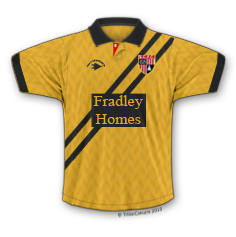 |
|
|
|
Post by Deleted on Dec 29, 2019 8:42:39 GMT
I don't know whether it's tainted with the whole relegation, but that blue away shirt with the red/white block across the top was awful. Just awful. Well and truly awful. Dreadful. Just dreadful. Well and truly dreadful. Disgusting. Just disgusting etc etc
|
|
|
|
Post by pottersrule on Dec 29, 2019 9:02:19 GMT
I wasn't a fan of the yellow away in our first prem season. it looked awful with the red brit logo Both home and away that season.....but the away was total shit!!! Shit yellow, shit blue, and like you say, a shity RED block in the middle of a yellow and blue strip......obviously no thought process went into it!!! A Tony Scholes design then? |
|
|
|
Post by Staffsoatcake on Dec 29, 2019 9:02:31 GMT
That pin striped one in the 80s.
Whoever picked that one, needed a prison sentence. 😝
|
|
|
|
Post by jonnybravo on Dec 29, 2019 9:34:15 GMT
Worst home kit has got to be 2010/11 one,so many away one's from the 80's and 90's to choose from though
|
|
|
|
Post by cobhamstokey on Dec 29, 2019 10:03:58 GMT
This mess from 96/97 This. One's Ive liked are the purple with white sleeves that Steino sported and the black with green sash. I dont mind the pinstripes. Most of the home ones are very similar but the umbro from the 70's / 80's was a classic. |
|
|
|
Post by drfootball on Dec 29, 2019 10:07:33 GMT
Any Stoke kit that messes with the stripes is bloody awful. Obviously, the Holocaust season kit was atrocious, and even though it recently seems to have enjoyed a 1980s kitsch revival in the club shop, I still shudder whenever I see it. Then there was the inaugural Prem kit, with the red back, and the relegation kit with the white back. Both bloody horrible. As a traditionalist, I maintain it should always be five white and four red stripes of equal width front and back, with white collar and cuffs. Shorts always white. The marketing department can have fun with the socks, alternating between variations on red and white, but that’s all they should be allowed to get near. Totally agree with this. A Stoke shirt should be white with red stripes,with the front central stripe a white one,trimmed in white and definately no black.White shorts and socks. The worst we've ever had? That Godawful Arsenal negative from 84-85. |
|
|
|
Post by Deleted on Dec 29, 2019 10:14:35 GMT
Any Stoke kit that messes with the stripes is bloody awful. Obviously, the Holocaust season kit was atrocious, and even though it recently seems to have enjoyed a 1980s kitsch revival in the club shop, I still shudder whenever I see it. Then there was the inaugural Prem kit, with the red back, and the relegation kit with the white back. Both bloody horrible. As a traditionalist, I maintain it should always be five white and four red stripes of equal width front and back, with white collar and cuffs. Shorts always white. The marketing department can have fun with the socks, alternating between variations on red and white, but that’s all they should be allowed to get near. I’m called pedantic when I say it, but our colours are white and red, and not the other way round, so 100% agree with this post. |
|
|
|
Post by Deleted on Dec 29, 2019 11:45:57 GMT
That god awful teal colour away kit we had. Think it was late 90s? It was so bad we let bury borrow it when they forgot their kit. Think we won 3-0 thorney hat-trick. Think it's the one I mentioned abit back, is it this one your referring to aswell? View AttachmentWas this the same year that the home shirt felt like it was made out of sack cloth? |
|
|
|
Post by scfcwebby on Dec 29, 2019 11:53:42 GMT
Our asics solid green away strip when we first moved to the Brit was one of my least favourites.. More its style & feel being worn as opposed to anything else. It was like a double thickness & I've never known a shirt that chafed the old nips while playing footy in it as much as this one! Awful shirt.. The home shirt that season wasnt much better either. View AttachmentI don't know why but every time I see this kit, I think of Jose Andrade 🤔 |
|
|
|
Post by Billy the kid on Dec 29, 2019 11:57:17 GMT
Our asics solid green away strip when we first moved to the Brit was one of my least favourites.. More its style & feel being worn as opposed to anything else. It was like a double thickness & I've never known a shirt that chafed the old nips while playing footy in it as much as this one! Awful shirt.. The home shirt that season wasnt much better either. View AttachmentI don't know why but every time I see this kit, I think of Jose Andrade 🤔 Kevin keen for me |
|
|
|
Post by redrob on Dec 29, 2019 12:23:02 GMT
1989/90 home shirt with pinstripes within the white stripes
|
|
|
|
Post by desman2 on Dec 29, 2019 12:27:57 GMT
|
|
|
|
Post by Linx on Dec 29, 2019 12:28:59 GMT
1989/90 home shirt with pinstripes within the white stripes I barely remember that one, but your description alone makes me feel ill. |
|
|
|
Post by desman2 on Dec 29, 2019 12:34:39 GMT
|
|
|
|
Post by Linx on Dec 29, 2019 12:58:46 GMT
Wasn’t that for something weird, like allowing for the poor visibility caused by the notorious Potteries smog in the pre-smokeless zone days? Or snow, or something? Either way it looks horrendous, although it was not unusual as a style; I recall Crystal Palace in the 60s having a similar home shirt in claret with pale blue thin stripes. |
|
|
|
Post by 1982stokie on Dec 29, 2019 12:59:22 GMT
The purple kit from around 1992 was dreadful. Was that the one with yellow and white zigzag lines on it |
|
|
|
Post by emery1985 on Dec 29, 2019 15:04:13 GMT
This mess from 96/97 That kit is class! |
|


