|
|
Post by FullerMagic on Jun 11, 2015 9:28:16 GMT
Very white-heavy, which I really like.... A few of their fans are commenting that the whiteness of it makes it a bit too "Stoke-like" - and yet we've gone very red-heavy this year. Sponsor looks crap though 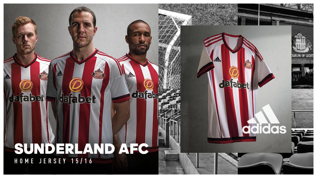 |
|
|
|
Post by KevinWhimper on Jun 11, 2015 9:31:22 GMT
I really like it. Get rid of the dark red/black bits on the sleeve and replace the sunderland stuff with Stoke stuff and for me it could have been a legendary Stoke top.
|
|
|
|
Post by realstokebloke on Jun 11, 2015 9:37:38 GMT
Yep. Like that. (Grr.)
Better than ours (Grr., grr.)
And yes, the key is the white with red stripes, not red with white. Albeit the red stripes disappearing off into the white side panel look naffo - ano golden rule should be stripes of equal width.
Bet they have white socks too (treble grr.)
Uber wanky sponsor & logo though (ha, ha) |
|
|
|
Post by haway on Jun 11, 2015 9:40:49 GMT
Very white-heavy, which I really like.... A few of their fans are commenting that the whiteness of it makes it a bit too "Stoke-like" - and yet we've gone very red-heavy this year. Sponsor looks crap though Why does the sponsor have to have such a disgusting logo? Ruins the shirt for me |
|
|
|
Post by metalhead on Jun 11, 2015 9:42:50 GMT
John O'Shea, the face of Sunderland  |
|
|
|
Post by realstokebloke on Jun 11, 2015 9:45:16 GMT
They've also mis-spelt "daftbet"
Which is a perfect description of what you are making if you lay odds on them staying up next season.
|
|
|
|
Post by lancashirelad on Jun 11, 2015 9:46:48 GMT
A lot better style than our own warrior one. Though in one outing our new one won 6-1.
|
|
|
|
Post by boskampsflaps on Jun 11, 2015 9:48:29 GMT
Nice that, such a shame  |
|
|
|
Post by FullerMagic on Jun 11, 2015 9:48:36 GMT
Very white-heavy, which I really like.... A few of their fans are commenting that the whiteness of it makes it a bit too "Stoke-like" - and yet we've gone very red-heavy this year. Sponsor looks crap though Why does the sponsor have to have such a disgusting logo? Ruins the shirt for me Yeah - Stoke are lucky that the sponsor logo has been pretty unobtrusive for decades now. How garish it looks can really make or break the kit, and the Sunderland one is a bit of a horror show. It's a very nice kit apart from that. |
|
|
|
Post by PotterLog on Jun 11, 2015 9:55:19 GMT
Looks cheap and horrible to me, far prefer ours.
|
|
|
|
Post by Olgrligm on Jun 11, 2015 9:55:36 GMT
Not for me. Too few stripes and the sleeves look daft.
|
|
|
|
Post by ruts66 on Jun 11, 2015 10:26:03 GMT
Is this one of those mass-produced, off-the-shelf patterns that will also be available to The Dog & Duck FC or an exclusive to Sunderland?
If the latter, you have to ask why we had to make do with bog-standard templates during our Adidas years...
|
|
|
|
Post by mailman44 on Jun 11, 2015 10:26:47 GMT
Very nice plus Adidas quality. Almost gives that club some bonafides, until you see John O'Shea's mug stuck on top of it.
|
|
|
|
Post by estrangedsonoffaye on Jun 11, 2015 10:50:43 GMT
Prefer ours to be honest, still think it looks pretty smart though.
|
|
|
|
Post by NassauDave on Jun 11, 2015 12:00:13 GMT
Very white-heavy, which I really like.... A few of their fans are commenting that the whiteness of it makes it a bit too "Stoke-like" - and yet we've gone very red-heavy this year. Sponsor looks crap though Adam Johnson is modelling the away shirt which is white with black arrows on it...:-) |
|
|
|
Post by unknown182 on Jun 11, 2015 12:10:32 GMT
I don't like it. They have to have thin stripes on the left and right because it won't fit into the shite Adidas template.
|
|
|
|
Post by wearepremierleague on Jun 11, 2015 12:15:13 GMT
Don't like it. Badge and adidas logo too far away. Also a disgusting sponsor. Our warrior one last year was pretty shit but I quite like this seasons.
|
|
|
|
Post by PotterLog on Jun 11, 2015 13:11:40 GMT
Right I know it's all about taste and everything, but seriously, anyone who thinks that mess - with it's slapped-on front panel, incongruous Adidas shoulder stripes and clumpy white sleeves and sides - is better than our simple, uniform design is fucking nuts. Ours is far superior! Theirs is bringing back chilling memories from our own disastrous first year with Adidas. *shudder*  |
|
|
|
Post by pottersrule on Jun 11, 2015 13:14:37 GMT
Very white-heavy, which I really like.... A few of their fans are commenting that the whiteness of it makes it a bit too "Stoke-like" - and yet we've gone very red-heavy this year. Sponsor looks crap though First time I've seen Larrson with his gob closed. |
|
|
|
Post by stokeramblers on Jun 11, 2015 13:15:54 GMT
Not enough stripes
|
|
|
|
Post by RipRoaringPotter on Jun 11, 2015 13:22:19 GMT
The problem with looking at computerised shirt designs is they all fucking ace.
I mean the way the shirt curves voluptuously at the waist is practically enticing you to suck it off, and then it broadens at the shoulders to make you think "Fuck, I'll look like a real man in that shirt!". And the collar, neatly wrapping around a vacant space, is just gagging to have my head put through it like a cock in a vagina.
And then, like having a shit while wanking, all this hot, shirty porn action is spoiled by the final design being modeled by John O'Fucking Shea.
|
|
|
|
Post by enuntio on Jun 11, 2015 13:35:03 GMT
Glad it's not ours
|
|
Martin53
Academy Starlet
 City til I die. Stoke til I croak.
Posts: 117
|
Post by Martin53 on Jun 11, 2015 13:53:46 GMT
With Adidas, like Sunderland are now, we got Adidas kits. With Warrior and New Balance, we're getting Stoke kits.
|
|
|
|
Post by heavysoul on Jun 11, 2015 13:56:00 GMT
I prefer the new Stoke NB home top loads better.
|
|
|
|
Post by Frogger Theft Auto on Jun 11, 2015 14:01:49 GMT
It's another lazy template, an all white version with a panel at the front and back for some mishapen stripes. At the very least you'd expect a template that works with stripes.
Our unique kit is far superior. Wouldn't pay more than £15 for a template kit.
|
|
|
|
Post by roostershair on Jun 12, 2015 11:15:13 GMT
I loved our 70s Strip with black collar and trim. Looked really good when they wore it with black socks and red socks!!!
|
|
|
|
Post by roostershair on Jun 12, 2015 11:17:08 GMT
I loved our 70s Strip with black collar and trim. Looked really good when they wore it with black socks and red socks!!! Should have said black SHORTS!!!!!!Was fantasising about Delia Smith  |
|
|
|
Post by skip on Jun 12, 2015 11:19:10 GMT
This Sunderland shirt is awful. The red and white are back to front and all the composite elements are all over the show.
|
|
|
|
Post by Mint Berry Barks on Jun 12, 2015 13:38:23 GMT
I'd go as far as to say that the new NB home kit is my favourite Prem home kit we've had.
I just really like it.
|
|
|
|
Post by lordb on Jun 12, 2015 13:57:09 GMT
I'd go as far as to say that the new NB home kit is my favourite Prem home kit we've had. I just really like it. only seen it on TV or on-line but yes I agree don't like teh away kit though |
|